Generic carousels do not usually look bad. They look forgettable. They are built from recognizable social-media parts, but none of those parts add up to a point of view. The result is content that feels competent enough to publish yet too interchangeable to build memory.
This matters for SEO and brand discovery because repeatable recognition is part of perceived authority. If every post feels like it could belong to any creator in your category, the feed loses distinctiveness quickly.
Generic design is usually borrowed design
The most common cause of generic design is over-borrowing. A team pulls headline styles from one reference, image treatment from another, and layout cues from a third. Each piece may look good individually, but the sequence has no internal logic.
That is different from inspiration. Inspiration becomes generic when the work never passes through a strong brand filter.
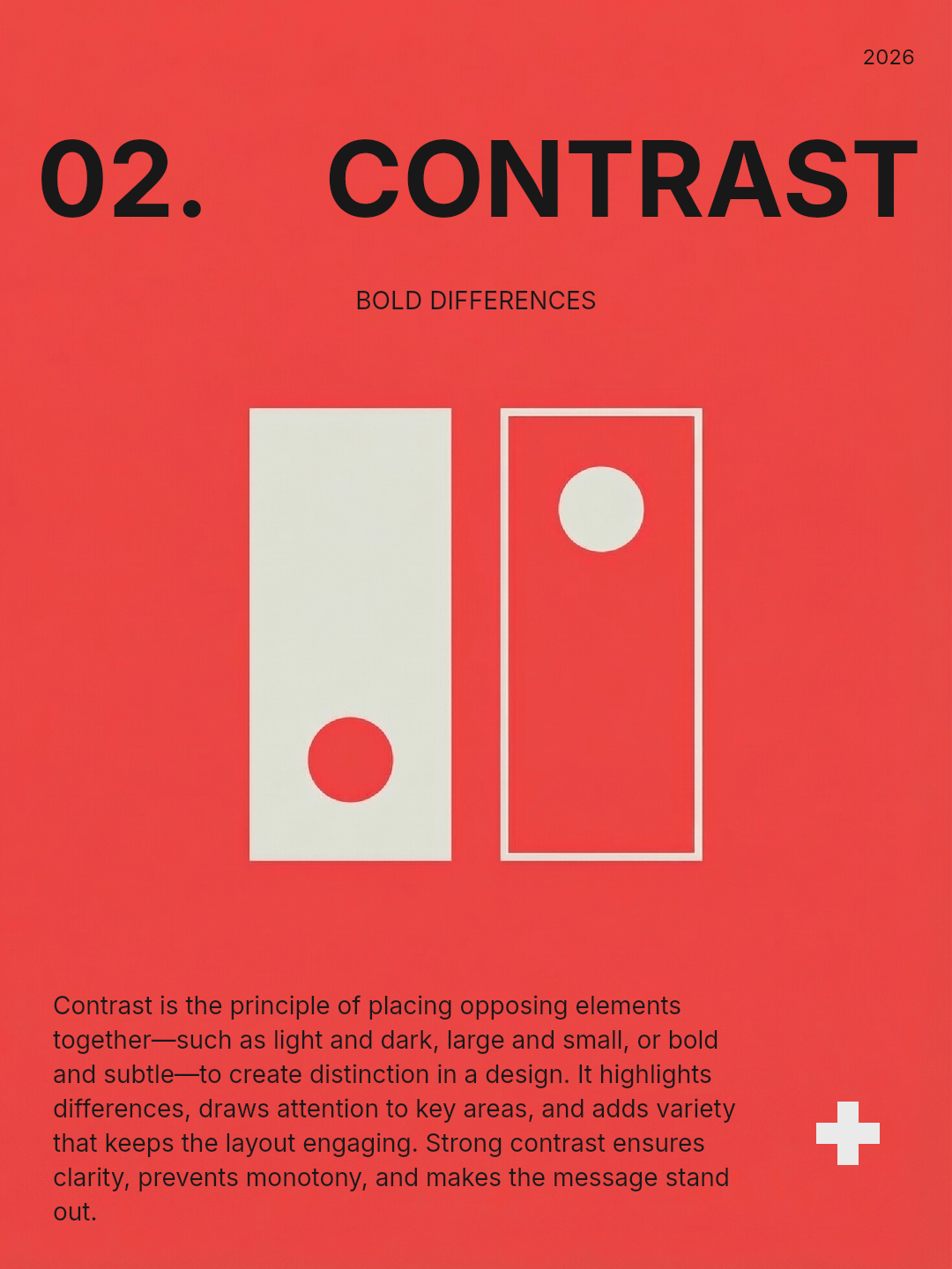
A point of view must show up in repeatable ways
Distinctive carousels usually repeat a small set of recognizable choices. That might be a type system, a way of cropping images, a style of headline writing, or a particular pacing pattern. These are not random signatures. They are the visible evidence of a system.
That is why one visual system can power a whole content series without making the output stale. Recognition grows when the audience can feel what stays stable.
Generic often means the message is generic too
A visual audit only solves half the problem. Many carousels look generic because the underlying idea is generic. If the post says what everyone else says in the same way everyone else says it, the design has almost no chance to save it.
A stronger angle often creates stronger design by default. Once the message has sharper tension, the layout can support something more memorable.
How to diagnose a generic carousel
Ask these questions while reviewing a post:
- If the logo were removed, would this still feel like our brand?
- Are the image, typography, and layout rules coming from the same system?
- Is the angle specific enough to create tension or memory?
- Does the sequence feel designed, or just assembled from social-media conventions?
If most answers are weak, the generic feeling is not accidental. It is structural.
Build distinction from rules, not random novelty
Trying to avoid generic work by making every post wildly different usually backfires. Distinction comes from coherent rules with taste behind them. Novelty without coherence produces chaos, not identity.
This is also why premium carousels often feel less generic. The restraint itself makes the design more ownable.
FAQ
Can templates make content look generic?
Yes, if the template becomes the whole identity. Templates are useful when they encode your rules, not when they replace them.
How do you make a carousel less generic quickly?
Sharpen the angle, remove borrowed visual clutter, and standardize the few cues you want the audience to remember. Improvement usually comes from subtraction before addition.
Final takeaway
Carousels look generic when nothing meaningful is held together. A stronger point of view shows up in both the idea and the design system. When those two pieces align, the content becomes more recognizable, more memorable, and harder to confuse with anyone else’s.
Leya helps make that alignment repeatable by giving your sequence a stable world to operate inside instead of forcing each post to rediscover its identity from scratch.