A carousel feels premium when it looks edited rather than overworked. Premium design is not about adding more texture, more effects, or more references. It is about choosing what to keep and what to leave out so the idea lands with confidence.
That is why premium is often confused with expensive-looking. Expensive-looking design can still feel generic. Premium design usually feels quieter, clearer, and more controlled.
Premium starts with restraint
The easiest way to make a carousel feel cheaper is to let every idea fight for space at once. Premium work usually makes fewer visual promises. The headline is clear, the support copy is supportive rather than competitive, and the number of decorative moves is limited.
This is closely related to how many words a carousel should have. When the copy is bloated, the design has to compensate with compression, and the post immediately loses its sense of control.
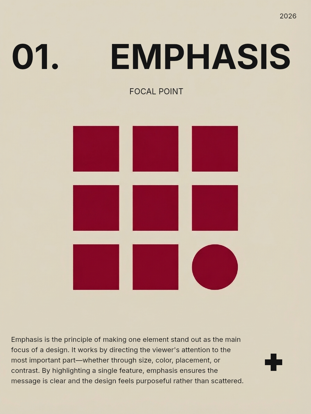
Typography and spacing do most of the work
Premium carousels almost always have clear hierarchy, intentional negative space, and a readable type rhythm. The audience may not consciously name those details, but they feel them. Tight spacing, inconsistent text widths, and noisy contrast make a post feel rushed even when the assets are beautiful.
A useful test is to blur your eyes and ask whether the slide still has one dominant read. If everything becomes equally loud, the design has probably lost its hierarchy.
One world matters more than one trend
What makes a sequence feel premium is often less about the individual slide and more about the continuity across slides. If the imagery, type, and pacing all feel like they belong to the same campaign world, the post gains credibility.
This is also where premium and campaign quality start to overlap. Carousel posts that feel like a campaign usually repeat the right cues instead of chasing a new visual trick on every slide.
Premium does not mean sterile
Some teams mistake premium for minimalism stripped of personality. That is not the point. Premium can be warm, bold, dramatic, or soft. The consistent trait is control. The design feels intentional enough that nothing seems accidental.
If you want to push the visual character, do it through a defined image language, a strong type pairing, or a disciplined color story. Those choices usually age better than novelty effects.
A practical premium review checklist
- Is there one dominant read on every slide?
- Does the support copy feel edited or crowded?
- Are spacing and text widths consistent enough to feel composed?
- Would the sequence still feel coherent if you removed one decorative effect?
- Does the post feel like a world, not a mood board?
FAQ
Can a carousel feel premium without professional photography?
Yes. Premium is mostly about editing, hierarchy, and consistency. Great imagery helps, but weak composition and clutter will still make the post feel cheap.
Does premium design always mean minimal design?
No. Premium means controlled, not necessarily sparse. Richer visuals can still feel premium if the hierarchy stays disciplined.
Final takeaway
A premium carousel is built on restraint, hierarchy, and coherence. The audience should feel that every design choice had a reason to exist and that the sequence was art-directed as one thing, not assembled from disconnected parts.
Leya helps creators hold that level of control by keeping the visual system steady while the content and framing evolve from post to post.