Yes, better visuals can increase saves, but not because audiences reward prettiness by itself. Saves rise when the design makes the post easier to trust, easier to skim, and easier to come back to later. In other words, visuals improve saves when they increase perceived usefulness.
This distinction matters because many creators separate “good information” from “good design.” On social platforms, those two things are fused. If the information is valuable but the post feels cluttered, generic, or hard to parse, the audience may agree with it without saving it.
People save what feels worth revisiting
A save is a promise to future-you. The audience saves posts that look organized enough to be useful later. That is why clarity matters so much. If the hierarchy is muddy, the value feels less retrievable even when the tip itself is strong.
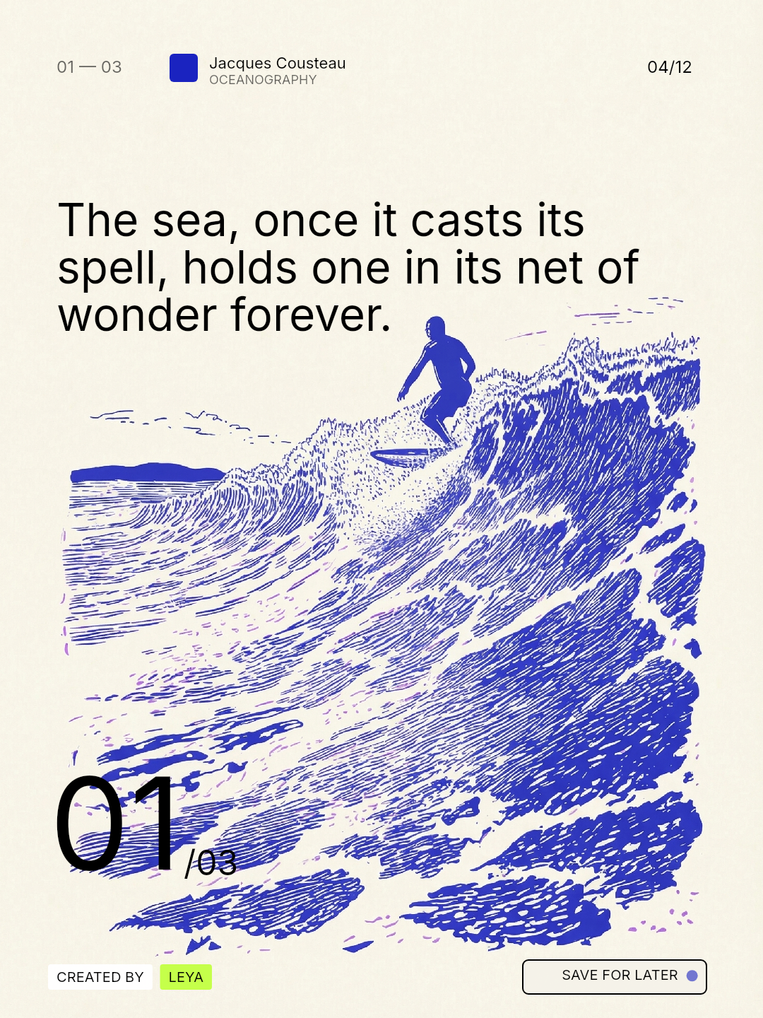
This is also why educational carousels that feel editorial often perform well. They package utility in a way that looks reference-worthy instead of disposable.
Visual trust affects behavior
The strongest design signal behind saves is trust. Clean hierarchy, breathing room, consistent type behavior, and a stable visual world tell the audience the content was made carefully. That care increases the chance that the post will feel credible enough to keep.
This does not mean every saved post must look luxurious. It means the design should remove doubt. The audience should not feel like they are saving something messy or half-finished.
Design for retrieval, not only for attention
Many social posts are optimized for the stop, but saves depend on the return. Ask yourself whether the slide structure will still make sense three days later when someone reopens the post. Strong saves usually come from layouts that make the main takeaway easy to relocate.
Useful tactics include:
- One dominant idea per slide
- Predictable text placement
- Clear contrast between headline and support copy
- A final summary or checklist that can be scanned quickly
That retrieval mindset is also why slide-one clarity matters. If the opening promise is muddled, the rest of the sequence rarely feels valuable enough to archive.
Measure saves with visual hypotheses
Instead of guessing, test a simple visual hypothesis over several posts. For example: does a more restrained cover increase saves? Does a tighter slide count help? Does a clearer closing checklist change how often people return to the post?
This lets you learn what kind of visual packaging helps your audience behave, not just what looks fashionable in your niche.
Example: the same tip, two different save rates
Imagine two posts teaching the same carousel lesson. One has crowded slides, inconsistent spacing, and no clear summary. The other has a strong cover, one idea per slide, and a clean final checklist. The idea is the same, but the second version is easier to retrieve later. That is why it is more likely to be saved.
FAQ
Do better visuals matter more than the idea itself?
No. The idea still creates the reason to save. Visual quality increases the chance that the audience recognizes that value and wants to keep it.
Are saves mainly driven by educational content?
Usually, yes. But educational content still needs strong packaging. A useful idea that feels hard to re-access will not perform as well as a useful idea that feels orderly and memorable.
Final takeaway
Better visuals increase saves when they make the content feel easier to trust and easier to retrieve. The goal is not decoration. The goal is packaging value in a way that the audience believes is worth keeping.
Leya helps do that by aligning message, hierarchy, and visual continuity so the content looks as useful as it actually is.